
My Summer Photos |
About my Work:
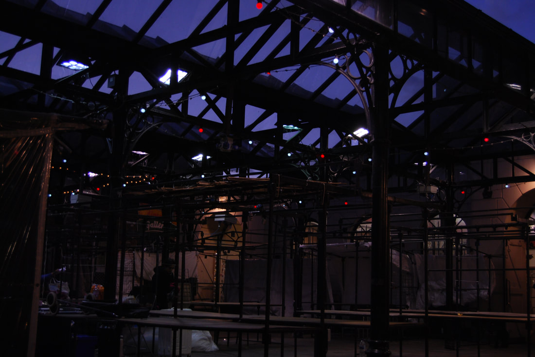
Throughout my holiday in Poland and England I wanted to focus my photos on landscape and architecture, I've always been fascinated in the natural light and how it can effect scenery especially water. I believe that lighting always plays a great role when taking the a picture, the way it can make something just stand out, that nature itself can show its true beauty if you just wait that without people there is always a sense of calmness a sense of peace.
In some sort of way all these photos link together, by including vegetation or some sort of building they all try to portray what a beautiful planet we live on. In my opinion some of this is obstructed by human life but at the same time it shows how inspiring we all can be, we may destroy a landscape but we can build something outstanding.
All these photos suggest that I'm an out going person, I'll always try and find a perfect scene even if it will take an hour to get it perfect or if I need to climb a tree. I never go to the same place twice, unless its to see my family, but I usually travel to different countries. And I believe that there are places which deserve to be recognised for their beauty and I will always try to capture what I feel at that moment and try to share it with others.
I believe that I was both successful in composition and lighting, especially for the lake photos. I would sit for an hour waiting to get a perfect reflection in the water but also taking in consideration of the placement of the land. I also like to focus on texture how old patterns have survived to this day but look as if they where purposefully made to look that way.
Other Photos
I
I


My Summer Tasks
|
- Tate Modern This is a photo which I took in Tate Modern, the reason why I took a picture of this is that it really caught my eye. I really like the idea how there are old black and white images which overlay in different shapes. Also putting it on coloured squares brings your attention to the pieces. Also, the placement of the different artworks makes me thing on how I can manipulate images to come out how I want them to. I sadly cannot remember the name of the artist and I didn’t want to include myself in the image as it would destroy the message it tries to portray. |

|
|
- National Gallery This piece is the Salisbury Cathedral, the reason why I took a photo of this is that I really like the general feeling that it gives out. I've always been fascinated by the past, especially old architecture. Even though the the piece is quite dark you can truly understand how it was back then, not having electricity and having to really on natural lighting. But also I like the composition of the piece, that its not only focused on the Cathedral but the whole environment around it, giving this sense of realism. "Representing the climax in any survey of the full cycle of Constable’s large landscapes" - Parris |

|
|
- Tate Britain This piece is called 'DON'T WORRY' by Martian Creed, I took this photo because I really like the idea of the neon writing. How its lighten up and brightly portraying the message 'don't worry' so that the viewer understands thats what the artist is portraying. Having nothing in the background but just a white wall makes it really effective especially when there is no other light but the yellow neon. "The phrase ‘DON’T WORRY’ is ambiguous in that it is apparently reassuring yet implies that there is something to be anxious about." - Micheal Archer |

|
CONTEXTUAL ARTIST 1 - LEE BUL


Introduction to Lee Bul
Lee Bul was born in South Korea 1964, she spent most of here childhood fleeing persecution and moved between homes. In 1984, she enrolled at Hongik University to study sculpture she then graduated in 1987 from art school. She went on to present a public performance, in 1988, and carried on producing work involving the body.
In her work you can clearly see that she works around the human body and the environment, this can be influenced by the childhood she had. She manipulates the body to create beings beyond reach; having multiple limbs. Or an environment which displaces you, makes you feel different the more you think about it. Reviews say that she creates a spectacular dream-like landscape which features monstrous bodies, futuristic cyborgs, glittering mirrored environments and an exquisitely surreal monumental foil, this again enhances the idea of her work being some supernatural something that can be seen as good but too can be interpreted as bad. By using the materials shown above in her work it allows her to portray the message she wants, to get it perfect in her option. Making us understand that there are always people who will see the world in a different perspective.
My first practical response
I was tasked to take photo in the style of Lee Bul, I was put into a group which had its own set up. From there I manipulated the set so that it would like something Lee Bul would create but not exactly copying her style, on the table there where fairy lights, pieces of wire and gold tinfoil; with these resources I could create a distortion.
There was a total of 3 different sets, after taking pictures I carried onto the dark room. There was a piece hanging from the ceiling, this is where I had to take composition to play a big part. I tried to centre the sculpture and manipulate the directional light so that it would high light certain places. Also putting the image in the central frame was important as I wanted it to signify that this was the main focus, by having this isolation it makes you think about what message I was trying to deliver. Again the way this links into Lee Bul's work is the material, the way the stings create a boundary but just barely withstanding this potential that was leaking.
The final set had materials which where uncommon, but also taking the idea of using plastic cups as a stage from Lee Bul enabled me to stack other materials and create a sculpture which stood but was deformed at the same time. Also using the mirrors to have both the reflection of the light and sculpture to create an after effect and manipulating the light to create a series effect.
Here are the pictures I took during the practical:
Composition
The way elements have been arranged the way I wanted to clearly portray a message. Composition means 'putting together' and can apply to any work of art, from music to writing to photography, that is arranged using conscious thought. Here I took into consideration what I wanted in the shot, and where it was placed creating an atmosphere that I thought would be perfect to the shot. By manipulating my body and contorting myself so that the shot would come out perfectly and allowing you to see the objects in the photo.
The way elements have been arranged the way I wanted to clearly portray a message. Composition means 'putting together' and can apply to any work of art, from music to writing to photography, that is arranged using conscious thought. Here I took into consideration what I wanted in the shot, and where it was placed creating an atmosphere that I thought would be perfect to the shot. By manipulating my body and contorting myself so that the shot would come out perfectly and allowing you to see the objects in the photo.


Lighting
This is where I tried to change the lighting with the directional light to get the perfect contrast. Photographic lighting is the illumination of scenes to be photographed. A photograph simply records patterns of light, colour, and shade; lighting is all-important in controlling the image. In my opinion light always plays a great role as it allows the curves and details stand out giving it more of a definition, almost giving it a back story. I positioned the directional light so that I could get the perfect shot that I wanted highlighting the specific areas I wanted.
This is where I tried to change the lighting with the directional light to get the perfect contrast. Photographic lighting is the illumination of scenes to be photographed. A photograph simply records patterns of light, colour, and shade; lighting is all-important in controlling the image. In my opinion light always plays a great role as it allows the curves and details stand out giving it more of a definition, almost giving it a back story. I positioned the directional light so that I could get the perfect shot that I wanted highlighting the specific areas I wanted.


Close Up
This is where I went really close to the objects to get a fine and defined photo. This is also classified as still photography, and the comic strip medium is a type of shot that tightly frames a person or object. Close-ups are one of the standard shots. By taking close shots it allowed me to show the minor detail that may not be seen from a normal image, allowing the hidden textures to stand out.
This is where I went really close to the objects to get a fine and defined photo. This is also classified as still photography, and the comic strip medium is a type of shot that tightly frames a person or object. Close-ups are one of the standard shots. By taking close shots it allowed me to show the minor detail that may not be seen from a normal image, allowing the hidden textures to stand out.


Materials
In these photos I wanted to focus on material and detail, here you can see the imperfections of some materials. Materials too can play a great role, they allow you to have a texture to the piece this will let the viewer understand what message I wanted to show and what feelings would be portrayed. I tried to focus as much as I could on the singular detail of the material because it itself can show a journey that only the viewer may see.
In these photos I wanted to focus on material and detail, here you can see the imperfections of some materials. Materials too can play a great role, they allow you to have a texture to the piece this will let the viewer understand what message I wanted to show and what feelings would be portrayed. I tried to focus as much as I could on the singular detail of the material because it itself can show a journey that only the viewer may see.


Isolation
In these photos, I decided I would isolate certain parts of the sculptures. This enables me to learn how isolation can play a great role, how the object by itself is able to portray a message in itself. By using isolation it allowed me to focus only one one thing which captured my eye, and this I too thought would catch the viewers eye. By using this your focused on the subject which is in front of you nothing else is in the way and you can observe this singular object in all its glory.
In these photos, I decided I would isolate certain parts of the sculptures. This enables me to learn how isolation can play a great role, how the object by itself is able to portray a message in itself. By using isolation it allowed me to focus only one one thing which captured my eye, and this I too thought would catch the viewers eye. By using this your focused on the subject which is in front of you nothing else is in the way and you can observe this singular object in all its glory.


Best 3 Images:


|
- I believe that this is one of my best photos which I took, I really like of the lighting which helps the wire in the materials stand out as if it where to go escape it’s captivity. I also focused on how I could manipulate the composition, I tried to centre the object and change the aperture so that background wouldn’t effect the central image. - Here again I wanted the light to give a better definition to the material, the darkness around the object somewhat being retracted by the light. The way the rope makes certain places stand out, especially the focus point where the green rope has the greatest influence. As if it where trying to break free of these restraints but still being unable to go and reach its potential. - Continuing this example of light, I really like how this photo just stands out. The way I positioned the lights was in a specific order but at the same time making it look as if it where a complete mess. How the light reflects of the table just enhances the interest point, just the table being lighten up and nothing else. I tried to have it at eye level, so that the background didn't play a great role on it, but it just makes it better as if the light is fending away this darkness. |
Formal Elements
A successful photo relys on order, and the main elements that bring and emphasise order in the composition are: line, shape, form, texture, pattern and colour. Every photograph intentionally or not contains one or more of these elements.
|
In total there are 6 formal elements:
- Line - Shape - Form and Tone - Pattern - Texture - Colour |
Artists also have to take into consideration and be able to manipulate the principles of design which are:
- Balance - Contrast - Movement - Emphasis - Proportion - Unity |
I was tasked to take 35 pictures of different material and using a range of settings on my camera and my knowledge of framing, these also have to relate to previous work based on Lee Bul. I had to consider the setting I was using at the time and what was the most effective thing to take photographs of.
I had to consider my lighting, camera angle and my proximity to my chosen subject matter. As I was looking for materials I would have to be very close to my objects so that you could see what material its made of, the way I would draw people's attention to what I want would be by central framing it this will clearly show that it's the main focus of the photo. I would also have to take into consideration on how I would ensure that everything is in focus, this I did by change the focus lens according to the photo for example: if I was taking a photograph of a leaf I would have to make sure that you can clearly see the subject matter. I decided to take different photos to show different ideas, as Lee Bul specialised in different materials in her work.
I had to consider my lighting, camera angle and my proximity to my chosen subject matter. As I was looking for materials I would have to be very close to my objects so that you could see what material its made of, the way I would draw people's attention to what I want would be by central framing it this will clearly show that it's the main focus of the photo. I would also have to take into consideration on how I would ensure that everything is in focus, this I did by change the focus lens according to the photo for example: if I was taking a photograph of a leaf I would have to make sure that you can clearly see the subject matter. I decided to take different photos to show different ideas, as Lee Bul specialised in different materials in her work.
Aperture and Macro
In this lesson, I had to use props that I found to take macro photos, this involved me in having to zoom into the objects with my cameras, it should be very hard to be able to tell exactly what you are looking at in a macro photo.
Macro photos are zoomed in images of materials and objects in order to get photos that are very interesting. When taking macro photos is that is based on objects that are very close to the lens nearly making it impossible for the viewer to be able to make out what the object is, this is a good technique as it allows you to see the micro details in the material or object but it also has a down side that (in my opinion) it doesn't show much and restrict the viewer to one place. The way micro photos are taken is very simple: the only thing you have to do is literally zoom into the object but also taking into consideration what you want to actually show.
Another technique that I used was aperture, this is where you change the size of the hole in the lens. By changing the hole size in the camera is like our eye reacting to the light, when the iris of the eye is small little amounts of light goes in. In a camera it works the same little amounts of light gets into the camera therefore it makes the depth of field in the photo deep a number which would be used for this aperture would be F/32.0 for example this will make the photo clear. By using a smaller number for example F/3.2 it creates a large lens allowing more light into the camera which creates a shallow depth of field making the photo blurry. This in my opinion is very is a very effective technique as it allows the subject of the photo stand out and you don't have to completely erase the background but having it blurred also make it seem as if it were dream like.


Texture and Pattern
|
Texture:
No design element is more capable of moving your deep emotions than texture. The challenge of seeing and capturing texture is mostly based on one element - light. Texture can be accentuated by the side light of a early sunny mornings or early evenings. Texture is the perceived surface quality of a material. It can be an element of both 2 or 3 dimensional designs and is distinguished by its perceived visual and physical properties. |
Pattern:
Pattern is a structure that organises surfaces or structures in a consistent way, they can be described as a repeating unit of shapes or form, but it can also be thought as the 'skeleton' that organises the parts of composition. There are two techniques that come into practice: Emphasising, this is where a pattern can accentuate a sense of size and expansion. And breaking, this is all about finding and object that disrupts the continuous flow of a pattern. |
Three Arists I've Chosen
The Big Klosowski
|
Why I've Chosen Him: - This photo was taken by The Big Klosowski, and the reason why I've chosen him is because it links both to Lee Bul and texture/pattern. The way it links to Lee Bul is the windows acting like glass and reflecting the glass giving an visual effect as it carries on. There are different patterns located throughout the photo: the brown panels on the right and the segregated windows on the roof. I really like the style of his photos as it shows human design, again linking to the idea of architecture. |

|
Mark Mawson
|
Why I've Chosen Him: - Mark Mawson specialises in shooting colourful liquids, the reason why I've chosen him is because of the way the smoke creates a whirlwind of pure colour. I really like the idea and how something can be manipulated to create something only some people see. The way this links into Lee Bul's work is by the isolation of the smoke, how its the main focus of the photo but also making it standout. |

|
Chester Wade
|
Why I've Chosen Him: - Chester Wade works with neon signs found in Chicago. The reason why I've chosen him is because I really like how neon lighting can effect the state and mood of the picture. The way it links to Lee Bul's work is the colours, in some of her work she works with flesh like colours which are also seen in this piece especially at "need is" part. |

|
Photographers Analysis
|
Mark Mawson:
- Key Words: Abstract Visible Unique Dynamic Ambiguous Intriguing Liquid Contained Smoke Ripples Marbles Intoxication |
Aqueous:
This piece is from Mark Mawson and is a piece of the Aqueous section he hasn't named the piece as he makes so many that nearly look identical but different at the same time. He specialises in shooting liquids and how the colours can create something beautiful also the name 'Aqueous' tells us that his work specialises in water, especially contained water. The way this photo is effective is how the smoke/liquid is in the central frame, drawing your attention immediately to it also with the use of a dark background makes the photo standout that bit more. By having a source below that almost looks like blue marble gives the piece more of an ecstatic feel, and the smoke emerging from the piece as if smoke is trying to escape and spread in this void. Even though this may look like smoke its actually liquid, by using paint and funnelling it into a liquid makes it appear as if smoke is forming also by flipping the image it makes it look as if it's coming out and not going in. The way this photo links into Lee Bul's work is the ripples which are found in this 'cloud', it represents the material which Lee Bul used for her distorted figure. Even though Mark Mawson doesn't specialise in the human body you can still see distortion in the piece, that it doesn't go in a straight line that water itself can distort both vision and objects. By not allowing any light through and only focusing on this cloud it gives it more definition, enabling the cloud formation look as if its a mushroom (almost like a mushroom cloud given by an atomic explosion). The mood can be different for every viewer for me its an explosion of freedom, this is mainly shown by how the smoke comes out of the marble. But for others it can be interpreted differently for example its actually shows fear, as this abyss is being filled with deadly smoke. No questions were raised. Sadly Mark only presents his work on his website and sell privately, so there is no way of describing how the piece would look in a gallery. The way I would like to incorporate his work into my own would be to take the idea of smoke, by doing this I will be able to learn how I can manipulate smoke to create abstract. I will also incorporate the idea of how the smoke consumes the darkness, I will make the smoke consume objects, surfaces or even people. By using this I think it will grant me a large leap as I will be experimenting with something that I have never done and is rarely seen. |

Techniques:
Mark Mawson used very little amount of techniques, but he used them effectively. By having the cloud in the centre frame clearly makes it the main interest, this is very effective as there is no background to disturb his piece and his message is clearly portrayed. By taking the photo in portrait also helps the centre frame. Another technique which he used is the macro, he had to take the image very close as the liquid which he would take the picture of would be very small. This is done very well as it doesn't look as if it is zoomed and you can't clearly depict what it actually it is, as if there is a hidden message. Mark was able to manipulate the visual in both real life and digitally, first he was able to shoot the liquid into another liquid creating the pattern and then changing the contrast, brightness, background and colour in so that it look like its by itself. As the work was manipulated digitally you can suggest the he has used artificial lighting to get those defined clouds. |
Studio Photography
Form and colour
Form is a three dimensional representation of an object, photography is a two dimensional form lacking the depth which poses a challenge to you as the photographer to somehow represent the third dimension by creating an illusion of depth. By using light and shadow you can create an illusion of depth in your photos.
Tone is a major design element we all love, colours play a important role to set the mood of the photograph. The colours can be broadly classified as warm and cool colours. Red, orange and yellow are the warm colours that suggest the feeling of warmth, liveliness and energetic whereas blue and green are cool colours that suggest the feeling of calmness, tranquillity and sad/gloomy.
In the In Studio Photography, which is mostly used for portraits, we are able to have more control over all the elements contained within the photo itself, such as lighting, composition, background and styling.
Why do we use artificial light?
In the lesson we learnt about form and tone, form is linked to 3D shapes and is created by shadows and highlighting. The reason why we use artificial light is because there might be a lack of natural light and are not able to take a bright picture, another reason is that we have more control over the light: we can position it where we want it and able to get the effect we want this also links to the idea that we actually 'make' the photo and not just take it.
"Sculpting with Light"
Step By Step:
1. Decide on general effect
This is where you choose what type of photograph you want to take, how you can move the direction and angle of the light.
2. Add the key light(s)
This is where you create domination of highlights and shadows by adding specific artificial lights e.g. directional light.
3. Place the fill lights
This is where you add other lighting equipment so that the ratio of the lighting gives the effect you want.
4. Separate subject from background
This is where you choose what you want to be happening in the background for example: adding a light to give you a back lighting or what you want in the background; a black background or white. Also how far you want the subject to be from the background.
5. Make final adjustment
After taking a few shots this is where you analyse and re-adjust your camera to make the photos better.
|
Rembrandt Lighting
This is a technique where one light and a reflector are used they are positioned so that only half of the face is lighten up. It produces a harsh and dramatic feeling when taking portrait pictures. An important note is that a triangle has to be formed under a eye. Usually the camera has to be set in a 45 degree angle from the face so that the other side of the face doesn't get highlighted. |
|
Butterfly lighting
First thing, the reason why this is called butterfly lighting is because of the shape which is formed by a shadow under the nose, in this shot there is only one light source being used. It enhances the 3D shape of the face giving a soft texture which links into glamour and innocents. The way this shot is taken is by having one light which is located above the persons head gleaming down upon them giving a shadow below, from here the best way to take a photo was in portrait as I only needed the face as it was the focal point of my photo. Overall I believe that this technique can be useful in a specific situation.
First thing, the reason why this is called butterfly lighting is because of the shape which is formed by a shadow under the nose, in this shot there is only one light source being used. It enhances the 3D shape of the face giving a soft texture which links into glamour and innocents. The way this shot is taken is by having one light which is located above the persons head gleaming down upon them giving a shadow below, from here the best way to take a photo was in portrait as I only needed the face as it was the focal point of my photo. Overall I believe that this technique can be useful in a specific situation.

|

|

|

|
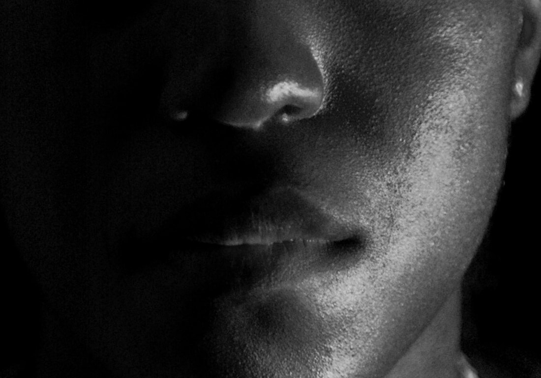
Side lighting
This technique also uses one light source which is positioned on either the right or left side of the subject, it should create a shadow which shows nothing. This creates a harshness on the subject also it can portray duality of something / someone. One thing that you must be careful of is to avoid burnouts as it leaves bright white patches. By using this technique it can create a scenes of mystery or duality, by having this darker version of yourself hidden behind the darkness. This technique I am particulary fond of because so much can be interpreted from it, almost creating a story for the person in the photo. It also draws attention to any viewer as the focal point would be the left side of the face, and because of this a greater study could be done showing its true nature.
This technique also uses one light source which is positioned on either the right or left side of the subject, it should create a shadow which shows nothing. This creates a harshness on the subject also it can portray duality of something / someone. One thing that you must be careful of is to avoid burnouts as it leaves bright white patches. By using this technique it can create a scenes of mystery or duality, by having this darker version of yourself hidden behind the darkness. This technique I am particulary fond of because so much can be interpreted from it, almost creating a story for the person in the photo. It also draws attention to any viewer as the focal point would be the left side of the face, and because of this a greater study could be done showing its true nature.


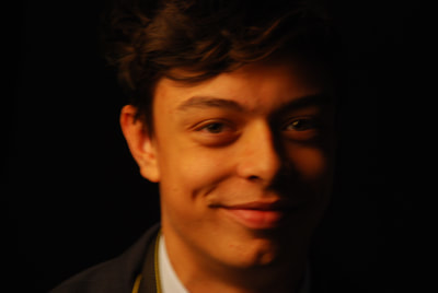
Back-lighting
This techniques requires to put a bright light behind the subject this creates a 'halo' effect which defines the subjects shape, it also creates an obvious focal point. During this photo shoot we set up a white filter so that the light wouldn't be so intense when taking the photo, I then also proceeded to use a diffuser at the from and changing the light of it so that it would make the focal point stand out more. During this photo shoot I wanted to experiment with (as you can see) to see what kind of outcomes I could come up with. Overall I believe that this technique is effective in its own way, it shows something new and can create a deeper meaning to the photo - the idea of someone being angelic or holy because of the 'halo' which is created.
This techniques requires to put a bright light behind the subject this creates a 'halo' effect which defines the subjects shape, it also creates an obvious focal point. During this photo shoot we set up a white filter so that the light wouldn't be so intense when taking the photo, I then also proceeded to use a diffuser at the from and changing the light of it so that it would make the focal point stand out more. During this photo shoot I wanted to experiment with (as you can see) to see what kind of outcomes I could come up with. Overall I believe that this technique is effective in its own way, it shows something new and can create a deeper meaning to the photo - the idea of someone being angelic or holy because of the 'halo' which is created.


Myra Greene - Artist Analysis
|
- Myra Greene was born in New York, 1975 and grew up in Harlem. Greene, throughout her career, had gone through matters of race and personal identify in her work. She was raised in a black neighbourhood but always attended white schools, she was always aware of race and how it influenced her personal life. "I'm always thinking about race. I recognize it when I'm the only black person in a room. My white friends will notice I'm the only black person, too. But they don't notice a room full of white people." |

|
|
- Her work: 'Character recognition' uses high contrast of black glass ambrotypes, the reason being she wanted to learn how to make wet-plate Collodion it was also the very technique used for ethnographic classification, the act of categorising ethnicity in colonisation times. This process was used around 1850s and 1880s to create a unique images and makes the viewers consider the unidimensional way black people where viewed in society. This work is a response to her feelings about how society first categorised her by her skin colour rather then judging her personality, not only this but also about her features; her "black" qualities and instant recognition. The texture of her skin, her enlarged pores, her cracks still showing traits of the harsh conditions her ancestors experienced. The way she takes her pictures close-up and the tightness of the frame prompt an uncomfortable answer: uncomfortable is because of the past, referring to the trade slave and how people where like cattle and were perceived as animals. |

|

|
This linkage to historical African-American slave roots makes these images enforce powerful reminders of stereotyping. The way this work has been done was by a simple process: she would set up a camera and position herself in front of it. Her body's incredibly close proximity to the camera has meant that she could take photos of specific features of the face, in harsh lighting which helps to define characteristics and give a better curve to them. While looking at these photos my eye is always drawn to the focus of the it, especially the ones above. The focalisation on the nose or cheek takes my gaze, in the first image the contrast of the white background to the dark face. But not all her work focuses on slavery, she also took pictures of white people called 'My White Friends', even though she believes that racism played a great deal in her past we were able to overcome this. This is shown by her including white friends and her signifying that we have overcome this idea and now we somewhat live in a society where we're all equal. But this might not be the case it may be creating parallels and suggest that no matter what race, we all have characterisation and cultural signifiers to our appearance, that a white person's lips, complexion or smaller nose are as instantly identifiable as her own black features. In 'Character Recognition' her photos denies us a full portrait yet we are still able to know her ethnicity from the smallest of details.
My opinion on her work:
In my overall opinion her work sends a very strong message and her technique is somewhat unique to her background. What I find most compelling in her work is how she can portray a message by referring to the past, specifically the slave trade. Her use of extreme close shots enables me to understand that all features of the face have their own value that each part of it is an essential piece. By having the photos in black and white again pays homage to the past, also having the paper around look as if it were burning signifies how racism and slavery is starting to subside in our day and age. It also gives an overall eerie feeling, being this close to a face and seeing all the minor details also having it monochromatic black makes it just that bit scarier. In the second photo that I've chosen from Greene you can see that the focus is on the face, which creates the blur in the background. This technique makes the face come forth, make it the focal point of the photo also the use of a white background contrasted to the colour of the skin and the definitions on the skin to makes me believe that its where she wants me to look.
In my overall opinion her work sends a very strong message and her technique is somewhat unique to her background. What I find most compelling in her work is how she can portray a message by referring to the past, specifically the slave trade. Her use of extreme close shots enables me to understand that all features of the face have their own value that each part of it is an essential piece. By having the photos in black and white again pays homage to the past, also having the paper around look as if it were burning signifies how racism and slavery is starting to subside in our day and age. It also gives an overall eerie feeling, being this close to a face and seeing all the minor details also having it monochromatic black makes it just that bit scarier. In the second photo that I've chosen from Greene you can see that the focus is on the face, which creates the blur in the background. This technique makes the face come forth, make it the focal point of the photo also the use of a white background contrasted to the colour of the skin and the definitions on the skin to makes me believe that its where she wants me to look.
First Response to Myra Greene:
I was tasked to take photos of other people in the style of Myra Greene, this meant that I had to focus on specific parts of the face. I also needed to figure out how to make the face the specific point; this was done by me setting my aperture to F/3.5 so that it would that the background would be there but have no significant role. Lighting also played a great role in this, for this photo shoot I used a directional light to highlight and curve the features that I wanted.
I was tasked to take photos of other people in the style of Myra Greene, this meant that I had to focus on specific parts of the face. I also needed to figure out how to make the face the specific point; this was done by me setting my aperture to F/3.5 so that it would that the background would be there but have no significant role. Lighting also played a great role in this, for this photo shoot I used a directional light to highlight and curve the features that I wanted.


Second Response to Myra Greene:
I then went on to take photos in the style of Myra Greene, sadly I was unable to take pictures of any relatives so I decided to take selfies of myself. I tried to replicate the lighting that she used, highlighting the 'important' features of the human face. The way I did this was by manipulating a massive torch and moving it from different angels to get the right lighting. As Myra Greene specified on certain parts of the face, I believed that the eyes, hair, nose, ear and mouth are the most significant parts. I believe that I have done this effectively because of how the lighting was able to wrap around my face as well as setting up the aperture so that the main focus would be my face and nothing in the background.
I then went on to take photos in the style of Myra Greene, sadly I was unable to take pictures of any relatives so I decided to take selfies of myself. I tried to replicate the lighting that she used, highlighting the 'important' features of the human face. The way I did this was by manipulating a massive torch and moving it from different angels to get the right lighting. As Myra Greene specified on certain parts of the face, I believed that the eyes, hair, nose, ear and mouth are the most significant parts. I believe that I have done this effectively because of how the lighting was able to wrap around my face as well as setting up the aperture so that the main focus would be my face and nothing in the background.


Overall I believe to make it much more similar to Greene's work I will need to change the colour, mainly to monochromatic so I would be able to get the black and white style she has. I will also need to be able to edit them in the style she did, to make a homage to the past. This I believe would be done by making the edges look as if they're old and somewhat burnt from the amount of time they had to go through.
Editing the Photos
In other to improve my work and make it similar to Greene's work I edited the images into black and white.


I believe that this is the most successful photo as it clearly shows links to Greene and her work. One reason why its successful is that I have ensured the lighting was used effectively to highlight the features which I believed where most important, exposing the pores and imperfections of the human skin. This is shown by the little bumps and curvatures especially around the mouth where I focused the light on. The way it links to Greene's work is that the technique she used is very similar to how I've edited and positioned the camera, which allows layers of depth to be built as the contrast is very similar effect of the human form. Another way this piece is successful is because of me using the correct aperture so that a selection of the photo is blurred and my chosen focus point stands out, in this photo I decided to use a aperture of F/4.2 so that the background and unwanted features where blurred this will help the viewer to focus on what I wanted them too.
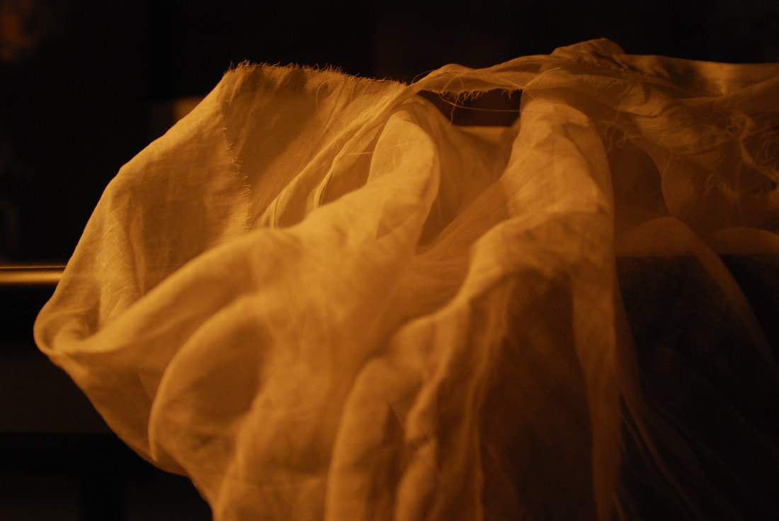
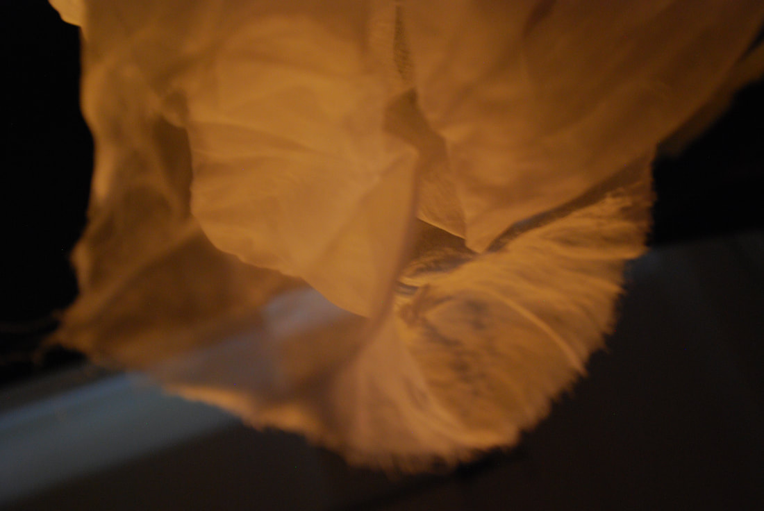
Response to my chosen Artist
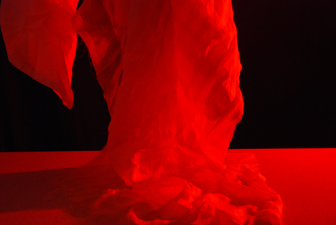
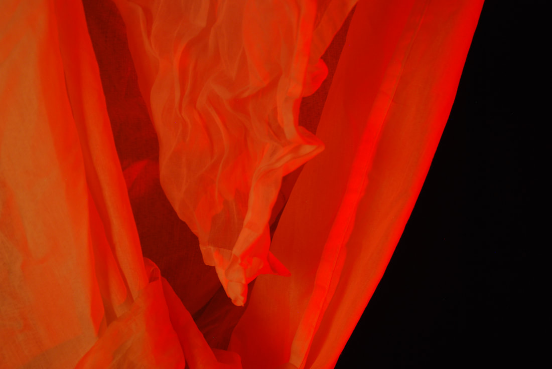
I was tasked to create a response to Mark Mawson, one of my chosen artists. Mark Mawson specialises in manipulating liquids making them seem as if they're clouds of smoke. I took this idea of smoke and tried to recreate it with cloth and composition. I had to figure out how I could use lighting, composition and aperture to be able to make the cloth look as if it was smoke. He also uses bright colours to show the curves of the 'smoke', so I decided to use red, as it makes the curves in the cloth stand out.
Here are the photos I took in response:
Here are the photos I took in response:


My Best Four:
|
In my practical assessment I had to show 4 strengths in my work:
1. Composition to strengthen the appearance of the subject. 2. Lighting to enhance the textural or pattern connotations. 3. Lighting to enhance the form of my subject. 4. Aperture to create clarity in my focal point. I believe that these separate 4 photos reflect these strengths, in my first photo I focused on the composition of the subject because I wanted to create this overflow of smoke. I wanted the material to be in the middle and having a large amount of it brings the focus of the viewer, also having nothing in the background wont distract the viewer. I didn't include the whole material because I believed that this was the strongest part of the photo, the shadow that is formed at the bottom almost makes it seem as if its ending there. In my second photo I focused on aperture, I wanted to show the clarity and focus of the material. Not only this it also helped it seem as if it truly look like smoke. I decided to use a F/3.5 aperture so that I would have a more blurry background, I positioned myself so that when I took the photo it would focus on a little piece of the material. This would create blur causing the background material to seem as if it were smoke. Even though I used material instead of smoke I had to figure out how I could make it seem like smoke, I also had to take into consideration the background. This is again why I've used a small aperture so that the the attention wouldn't be drawn somewhere else. In my third photo I focused on how lighting can enhance texture connotations, I decided to take inspiration form Mark Maswon and use a bright colour, the red helps the piece look as if it were red smoke. The lighting, at the bottom, makes it look as if the cloth that I used diffuses into it making it seem as if its a part of it. The harshness of this bright colour being directed into the material completely changes how it looks, I used a directional light to do this as it has the best manoeuvrability and the brightest lamp. This allowed me to create something that portrays the message that I wanted, not only this but also indicating different connotations to the photo. In my last photo I focused on how lighting enhances the form of my material, here I used two sets of lights: a directional light covered in a red plastic shooting a red light and a diffuser to soften this harsh red light. By having these two lights combing it allowed the form to stand out, the red signifying the important curves and points which are highlighted by the diffuser this allowed the material to stand out. Also relating back to the idea of it being smoke, the lighting almost makes it seem as if material combines but going in different direction. Almost like blowing smoke in a different direction and the folding in on itself creating these layers of different curvatures. |
|
Edits of My best Four
I then decided to edit the photos which I have taken during the assessment so that it could link into my chosen artist, Mark Mawson. As he used a bright blue colour I chose to incorporate it into my photos I did this by adding a filter over the photo to give it that blue definition. As he also had a black background I too wanted to use this in my work as it would make the 'object' come forth from the darkness. I too had to mess around with different settings like the brightness, curve and exposure so that I would be able to get the effect that I wanted. The message that I wanted to portray was that light and colour itself can change the whole object, the object that was used was a cloth but with the editing that I've added into it has completely changed showing how something so simple can be change into something you want. As Mark Mawson used liquids to create this visual of smoke I had to figure out how I could make a different object seem as if it were smoke, I decided to use cloth and then to edit it to make it seem as if it were smoke.


I then decided to edit them in the style I thought would be better, I wanted to add a white background to it as it made the cloth seem as if it where floating. The white background almost makes it seem as if it where weightless and it gives an ethereal look to it. The way that I've done this was by reverting it so that it would make the background white and make it seem as if it were smoke. I really prefer these edits from the ones above because it actually makes it seem as if it was smoke, as it has this vapour feel to it. Even though it goes against Mark Mawson's style by having a black background so that the smoke is enhanced by it, but white also have this effect and it also grabs your attention much quicker as its brighter. As the first two feel like the dissipate without sound as the third has a reverberate feel, moving slowly and the contrast specifically on the right makes it seems as if it gives out a noise. The slow movement also makes it seem as if it where an echo linking back to the reverberate feeling.


Line and Shape linking to Simon Phipps
In this lesson I was tasked to go on a route around my school and take photos in the style of Simon Phipps, this meant that I had to consider what would be appropriate to take a picture of. As he specialised in abstract and urban features I had to figure out how Line and Shape ( the focus formal element) would also be credential. In order to take photos of landscapes or close ups I had to change my aperture to suit my needs, I used a low number for my aperture so that there was a narrower depth of field so that the focal point was understood. I then used a high number for my aperture so that there was a wider depth of field which allows you to see the whole image.
Here are some of the following photos I took in inspiration to Simon Phipps:
Here are some of the following photos I took in inspiration to Simon Phipps:


I was then tasked to go out on a 25 to 30 minute walk around my local area, taking photos in the style of Simon Phipps. During the walk I had to take into consideration what I had learnt in the lesson, how could I show line and shape in my photos. At first I decided to find stuff around my house which had some sort of line and also trying to manipulate a shadow to create another line making it more interesting. After looking around my house I decided to walk outside and find buildings nearing the style of the brutalist architecture that can be found around London, but I also wanted to make line and shape play a role in my photos. Here are some of the photos which I took during my journey:


8 Edits relating to Simon Phipps
After taking these photos I carried on to Photoshopping them in Phipps style, I had to take into consideration on how I wanted the photos to look. In order to edit them I had to change the colour scheme to black and white, I did this by adding a layer over it which gave this effect. I then adjusted the colour levels to my opinion so that it would create a more harsh or lighter contrast. I later the altered the levels to make it better. I then carried onto the burn and dodge tool to enhance the highlights and shadows of the photo. If it was necessary I would crop the image using the rule of three so that the photo would have a clear focal point.


I believe that these are my most effective and successful photos I have taken, this is because I have understood how to show shape and line correctly.
|
My best Photo - Evaluation
I believe that from the 8 editied photos this is my best one. Here you can see that I've studied and figured how I wanted line to play a great part. By using a low aperture it allowed a singular line to stand out which allows the viewer to be drawn to it, I also used the rule of three so that again the viewer would be drawn to the top right corner. Lighting also played a great role I had to position myself to get a perfect reflection of natural light allowing the details to stand out. Overall I think that my editing in this piece is very good as I used the burn tool so that the humps which are seen on the surface would have a greater definitions adding texture to the piece. |

|
Layered Landscapes
Layered Landscapes are photos of landscapes which have been layered over another in a variety of different ways to display many different perceptions or times in only one image. These photos have been edited to change or to adjust the reality of the photo to create something abstract and interesting. Line and shape play a great role in these photos as it shows different qualities such as expressions or qualities of the photo, it enables you to create a key focus but also having a abstract angle can attract the viewers eye. Layered landscapes are made by using multiple photos in the same composition but with a slight or significant change in colour or light to show a clear contrast between the layers. As landscapes can change continuously over time it is very effective to show layered landscapes as only a slight change in lighting and colour or the information in the photo can show a different meaning and then having them overlap can then portray different meanings in one singular photo.
DIfferent Artists who use Layered Landscapes
|
George Rousse
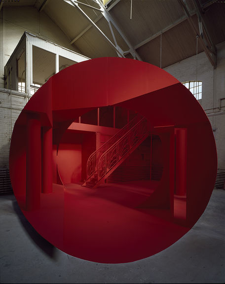
Keywords: Space, Architecture, Empty, Utopia Title: Geometries, Lima 2008 Form: An abandoned building with no sign of humanity, with a shape in the middle which transformers the image into a utopia. Having this segment in red makes you want to believe that this is the part referring to the utopia, he did this pay having the landscape painted and the position him self to get the correct photo. But the circle isn't full which can signify that only a portion of the reality can be shown. Process: i would first use a large aperture so that there would be a wider depth of field so that the image is clear, the F number I would use would be a F/21.0. i then would focus on the composition and figure out how 'line' would play a significant role in the photo, and how it would catch my eye. To create the red circle I would edit it in photoshop by adding a layer which is filtered red and then cut it into a circle shape to only have the segment to be filtered red. Content: His wok deals with Space and Time. Compels us to read architecture as static, then gradually transforms our perception of Space and Reality. Questions the role of photography as a faithful reproduction of reality. Connections to my work: George Rousse links into the theme of layered landscapes as he works with the temporal quality of the landscape and then adding a filter over it (layer) to change the reality of the photo. 
|
Idris Khan
Keywords: Depressing, Blurred, Black and White, Messy, Out of focus Title: London Eye, London 2012 Form: There are no colours other than Black and White. Always Landscapes. Transparent buildings placed many times over the image. Cloudy sky. Mirage - light is refracted. Process: I would situate myself (on a cloudy day) at a position where I could see the whole London Eye and from here I would use a high number aperture to have a wide depth of field. I would take multiple photos. Editing - I would use monochrome black and white and adjust the images. From here I would make them all have a low opacity and put them together. Content: Developed a unique narrative involving densely layered imagery that inhabits the space between abstraction and figuration. Speaks to the themes of history = black and white. Connections to your own work: Idris Khan clearly uses layered landscapes as he layers different photos containing different angles of the same structure. 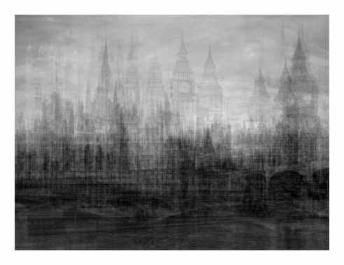
|
George Rousse - Formal Image Analysis
|
Keywords: Abandoned, Re-newed, Abstract, Line, Shape
The section this piece is placed in is called Construction/Deconstruction, the name of this piece relates to Montreal: Montreal 1997. I believe that this photo has a very powerful affect on the viewer as it makes them contemplate on what the message Rousse was trying to portray, by only including where he place is as its name may not only be its title the viewer is allowed to speculate what it might be. Overall this piece gives a mood of mystery and making the viewer also have a disbelief that the photo is actually real. I believe that by only including the name of where this piece was created doesn't create barriers for the viewer that the world has different interpretations and he is allowing us to figure out our own in his work, excluding itself for the usual photos we see today. In this photo you can see that Rousse has created a illusion in the middle of the composition, even though this goes against the rule of thirds it still brings our eye to the red as its the dominate colour of the photo signifying its focal point. In the piece we have two sections, a abandoned and run downed place contrasting to a refurbished and bright place. This in itself I believe is very effective as it shows what he whats, that a utopia can be created from anything even if its forgotten. This will grasp the attention of the viewer almost not allowing them to move away as they are dragged into this dream world Rousse has created. Another reason why I think this photo is successful is because of how he challenges the idea of the rule of thirds, the focal point is centred and not in the top left or right corner, by having such a defined colour gleaming out is the only thing that is needed to capture and hold you. These 'dimensions' created something that may never be a reality shown to be a fiction of our imagination, that we are able to create our own utopia if we so desired. Light may not play a great role in this piece, but elements are still shown. It allows us to see the definitions, almost making these 'dimensions' seem as if they were real. The use of both artificial and natural lighting add to this, having the natural show the shadows and angles in the real world and the artificial highlighting the most important details there. |
|
First attempt - Editing in style of Rousse


In these photos I've started to show my editorial skills in photoshop, using a layering technique to create different outcomes linking into George Rousse's work. I wanted to practice how to edit in this style and be able to show my skill in later work to the full response of the artist. These are stock images.
Gallery Response
Over the half term brake I was tasked to take photos in the style of George Rousse, mostly focusing on landscapes but also changing it up a bit. While I was taking these photos I had to take into consideration my shutter speed, aperture and composition. I wanted to take the perfect photo so that I would be able to show what Rousse showed in his work. Later I would then edit these (as shown above) so that it shows that I have an understanding of his work, that I don't just copy him but I work on his work trying to create this atmosphere of 'different dimensions' in my work. I only take inspiration form it and create something which related to me.


As these photos are supposed to represent George Rousse I decided to edit them in his style, from the selection I chose 12 to be edited into 6 photos. Here I had to decided how each photo would fit in with one another to create this illusion of a utopia or something different then the set area. The editing of the photos was very simple, first I chose the photos I wanted conjoined I then created a layer for the top layer so that I would be able to create a shape (circle - linking back to Rousse) and painted black. This deleted the that section of the photo enabling you to peer through to the other image, sometimes the photo wouldn't be aligned with the other here I had to consider how I could manipulate the photo so that it would fit perfectly with the front layer. Here are the 6 final edits I have completed:


Best Image Evaluation
|
I believe that this is my best image which relates to George Rousse's work, the reason why I believe this is because of the editing. This played a great role as it was the best way to show a 'dimension' being contrasted with another 'dimension'. I wanted to include some of Rousse's work into my piece, I did this by finding a place which looked like something that wasn't real and overlapping it using a circle shape just as Rousse. i had to figure out the composition of the piece as these where two different buildings so I had to take into consideration where I should stand to almost replicate the same photo. I then enhanced this idea on Photoshop manipulating the image so that it would fit in perfectly. Sadly the only thing I would improve would be the lighting, the way I would do this would be by taking the photo with more natural light (being there in the morning not afternoon) or adding some artificial lighting so that the image would be clearer and have better definitions.
|

|
